

Orchestrating Color: Landscapes and Seascapes (Online Workshop) Fall 2024 w/ Rose Irelan
September 5 to September 19 (Thursdays), 1:00 PM to 4:00 PM, Eastern Time
**All sessions are live and will be recorded, students do not have to be present. All recordings will be available to students for 3 months after the final session, after 3 months the recording will be deleted.
Please check your email spam/junk folder for your Zoom invite.
DEMO: https://youtu.be/58kRW6KN3sY
Workshop Description
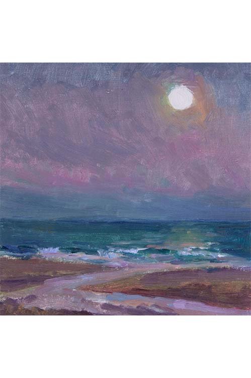
This course will explore how to orchestrate and design with various color palettes to give the painter the tools to inform their work with a deeper understanding of color and to empower their painting practice with more intentional color choices. Designed to demystify color theory, the artist will gain insight into how color can be used more thoughtfully to explore and find the poetry of painting in your painting practice.
Some key fundamentals we will cover in this 3 week workshop.
3 lessons with 3 different color plans
Practical and pragmatic approach to color mixing that works
How to achieve color harmony
Creating luminous color
How to “Key” a painting to a value family for a particular “feel”
Setting up your painting with a simplified value scheme and sticking to that when mixing your colors
“Relative color” and how to use it to make warm and cool harmonies for interest
Bringing Unity + Variety to your painting
Paint pigment properties and why and when to use certain pigments over others for achieving subtle or more bravado color combination
Workshop Outline
Week 1 -
Introduction to Color Theory and how we will be using various “color” sets for each lesson. We will explore some historical works and analyze those works to better understand how these artists have solved their paintings with practical solutions. I will conduct a case study on a couple of my paintings to share how and why I use specific palettes to take my plein air paintings to studio work.
Demo on how to set up a complimentary “Color Board”
Painting demo on color set applied to a study
Questions and answers on assignment
Week 2 -
Analyze Master paintings for the next color set. Discussion on understanding the properties of your tools, that is the pigments we use. When and why to use transparent and opaque pigments, when and why we use warm/cool temperatures or transparencies of the same color. Demystify color theory and define color harmony.
Week 3 -
Further exploration of how to orchestrate color for a certain emotive or poetic quality through examples of master paintings. Questions and answers on procedure, palette management or challenges and observations from students from the previous lessons.
Feedback on student work
Demo on how to set up third color board arrangement TBD
Painting demo on color set applied to a study
Questions and answers on assignment
Workshop Materials List
PAINTS (oil, water based oils or acrylic)
Cadmium Yellow Lemon or Light
Cadmium Yellow Deep
Cadmium Orange
Yellow Ochre (or Gold Ochre by Holbein, which is my preference. I also like Rembrandt Yellow Ochre)
Cadmium Red Light (make sure you have a red light not medium)
Alizarin Crimson
Viridian Green Hue (Holbein) or a regular Viridian green. I prefer the punch of the “hue”
Cerulean Blue Hue (great for skies, some water, and some paler greens)
Cobalt Blue (I love Holbein Cobalt Blue Pale but it is expensive so any other brand is fine)
Ultramarine Blue Deep (Ultramarine Blue. Holbein is the brand I use for the Ultramarine Deep. Rembrandt also has it. Regular Ultramarine or French Ultramarine Blue is fine.)
Winsor & Newton Blue Mauve Shade
Quinacridone Rose or Permanent Rose (mostly used for flowers, sometimes for skies and more brilliant
violets)Ivory Black or Chromatic Black. for value studies and for mixing only. Not straight out of the tube or to “darken” . Black is used as another option for blue as a modifier and mixer. I also keep a tube of blue/black, from Holbein, but do not use blue/black for value studies.
Titanium/Zinc White or regular Titanium White (large tube- 150 ml). Gamblin makes the blend that I use most. You can use plain Titanium White if that is what you have on hand. I use both for different reasons which we will go into in class.
DAILY TOOLS
Small Sketch book.
Color wheel
Value Scale
Paper towels
Disposable gloves or thin gardening gloves
Brushes can be cleaned with Murphy’s oil soap, dishwashing detergent, a soap bar or The Master’s Brush Cleaner (my favorite)
Sharpie Chisel Point Marker and 1 or 2 other black markers of varying points, Pencil
for quick sketches and pen for taking notes.
optional Gray markers (Tomboy or Blick Studio Gray markers) at least 3 shades of gray (optional but handy. Could use a pencil and vary grays). These could be used for small thumbnail sketches before you move on to your assignment each week.
BRUSHES
LONG HANDLE BRUSHES:
Silver Grand Prix Extra long Flats in 2, 4 and 6 OR similar brand: Natural Bristle Brushes or Hog Bristle brushes.
I also like Synthetic Flats-Brands: Princeton Aspen, Princeton Dakota (less expensive and great quality.) I also use Rosemary brushes, Ivory Extra long flats in 2,4, and 6)
Flats/Long Flats in a variety of natural hog bristle and Synthetic: I recommend a couple of each size from 1,2,4,6,8,10 .
You can use what you have on hand if close, or get a pack of brushes to make it more affordable.
I also like Silver Grand Prix Extra long Flats in 2, 4 and 6 especially as well as Rosemary Ivory Extra long flats in 2,4, and 6)
Short flats synthetics: size 3, 5, and 8 (optional but handy for initial wash-ins)
A few synthetic rounds for small detail work: 1, 2 size.
PALETTE KNIVES
1 or 2 palette knives for mixing. Make sure that they are the steel-tip kind, not plastic. I like the ones that are shaped like a long stretched out diamond shape.
PAINTING SUBSTRATES/SURFACES
Painting Panels 6” x 8” size - 8” x 10”. For your paintings you will need at least 3 panels and for color boards- you will need at least 3 8” x 10” or 9” x 12’ boards. You can also use Strathmore 400 Oil painting paper (see below)
For studies or a beginner painter, canvas panels (with cotton duck canvas) or fine to start with. Some artists shellac the cheaper panels so the paint does not absorb into the cotton canvas.
Arches and/or Strathmore 400 oil painting pads (9” x 12”) are great for studies and are a cost-effective solution. You can shellac the paper which gives it less absorption.
Linen panels are great to work with and don’t absorb like cotton duck panels. Centurion linen panels and Fredrix Linen Panels from Blick Art Supplies or Jerry’s Artarama are affordable linen panels. Linen is much more forgiving to work with as you can wipe off paint more easily on linen.
My favorite linen panels are Raymar painting panels 15SP, and Sourcetek Linen panels #66 or if you like more detail you may like the #13 . These are more expensive and may not be a good choice for quick studies because of that. I do use them for most of my plein air work as I am used to them and know what to expect under the pressure of having to work so quickly.
You can also use gessoed masonite panels.
Sourcetek Panels site: https://www.canvaspanels.com/OC-PANELS,101.htm
Raymar Panels site: https://www.raymarart.com/
SOLVENTS
Gamsol. I use a air-tight stainless steel brush washer that is about 31/2” high.